Events
How Taylor Swift Turned the Color Orange Into a Marketing Moment
Forget Gen Z Yellow and Pantone's Mocha Mousse
As the internet continues to lose its mind over Taylor Swift’s announcement of her new album The Life of a Showgirl, the color orange is having a marketing moment. The whole world seems to have turned a vibrant shade of tangerine.
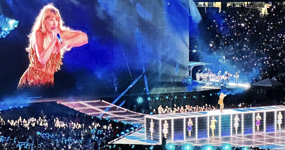
The mega-star announced the upcoming release on Travis Kelce’s sports podcast, followed by a sparkly orange countdown on her own website. This, combined with dozens of Easter eggs hinting at the color of Swift’s next era, made orange the new black.
Swift has long used colors to brand her albums, also known as eras. Midnight was dark blue. Reputation was black. Lover was pastel pink. So, it’s not surprising that Taylor would harness the power of hues this time around. And for Showgirl, her choice appears more influential than ever.
That’s partly because the album rollout rocks such cross-cultural convergence, spanning both the sports and music worlds. Brands and teams across the NFL and NHL, such as the Texas Longhorns and the Philadelphia Flyers, were among the first to pay tribute.
Advertisers followed suit, notably FedEx, which capitalized on its orange and purple logo, posting: “You know what looks good with orange?” Popeyes, which employs a similar palette, chipped in with: “Guess orange is trending now.” Dunkin’ and Sour Patch Kids followed suit. Even the Empire State Building turned orange for the launch.
The frenzied response doesn’t just showcase Swift’s immense cultural clout. It also highlights the ability of color to cut through in a world of visual overload. We process color almost instantly; it helps our minds create meaning before words and trust before proof. Color isn’t just an aesthetic choice, it’s an extremely powerful coded communique, evoking emotion and signifying purpose, values and self-expression.
For example, pastel colors like lilac, pale pink and mint green signify harmony, purity and simplicity. They tend to be used by skincare, beauty and wellness brands, from Tatcha to Glossier, across marketing and packaging.
At the other extreme, loud hues like neon pink and acid green denote rebellion and individualism. Last summer, it was impossible to escape Brat green, the branding for an album by Charli XCX. Soon, this unapologetically lurid color invaded the zeitgeist. Brat not only took pop culture by storm, it entered politics. Kamala Harris leaned in, turning her campaign’s Twitter page a loud shade of green.
Brands, from eBay to Lipton tea, rushed to cash in on Brat summer. But with every marketing moment, the window of opportunity is limited.
As the stampede for Brat and Barbie pink have proved, unless you lean in with flair and wit—in a timely way that feels authentic to your brand—you risk being seen as trying too hard (or as just another name in the crowd). Worse still, you might not be seen at all.
Brands seeking to align themselves with the Orange Era should emulate the queen of branding herself, Taylor Swift, by stressing authenticity, telling a compelling story and never underestimating their audience.
Otherwise, beyond garnering a few quick clicks and views, the buzz won’t last long without a relatable tale that’s worth sharing.
The 2026 Clio Music Awards are open! Enter your most creative work HERE by Oct. 3.