Odd Album Covers You Hate to Love From Queen, Aerosmith, Creed and More
Pierced udders, a 'Frizzle' fry, literate apes and berserk Americana
Ahhh, youth … full of crazy, boundary-pushing art and music that’s way too loud for my ears these days. In compiling this Top 10, I picked some inspiringly odd moments from the last few decades and didn’t have to dive too deep, since so much was lodged in my memory. There’s one great thing about being odd. You’re unforgettable.
The Offspring
Americana (1998)

You can glean a lot from how old I am to how I grew up (and likely where) by seeing this album represented. To me, The Offspring were a toe dip into angsty, non-conformist counterculture (which is dumb irony considering how many records this sold). It was something I played aloud around friends and never in front of my parents, as they would’ve assumed the worst. The art now gives me feelings of an innocent generation navigating a constantly changing social and media landscape while completely unequipped to do so. Back then, it was just sweet to see a kid hold a giant flea while an octopus reached for him. Cover artist Frank Kozik says he didn’t intend to infuse any meaning into it. So, my initial take, that this pic was just weird and rad, might be the best one after all.
Aerosmith
Get a Grip (1993)

Growing up, I had an older, cooler cousin who was into some sweet music, so I would always check out her CD collection. While this album wasn’t one of those gems, the art always struck me with its weirdness. A pierced cow udder with some serious vascularity and bad typeface is hard to forget … both stupid and kinda fun in not taking itself too seriously at all. Unfortunately, there are more teats than good songs on this one.
Giuffria
Silk + Steel (1986)

Who doesn’t love a good ’80s power ballad? Combine that with some righteous hair, a sky painting only a chrome bumper could love, plus those sweet, sweet headshots … baby, you got yourself a stew. I love the dramatic synth and helicopter sound effects reminiscent of Pink Floyd, and over-the-top singing, it’s all most excellent.
Limp Bizkit
Chocolate Starfish and The Hot Dog Flavored Water (2000)

You cannot have a favorite list of odd album art without including this Limp Bizkit album. Little naked bald men (maybe little Fred Dursts?) lounging in hot dogs while holding up a starfish with a butthole? You couldn’t feed the best AI generator that prompt and come close to the disasterpiece that you see here… all that while having terrible typeface decisions, and the image even looks stretched! Kids today can’t comprehend how big this band was, even while cranking out objectively bad music with this sort of album art. It was awesome!
Fleetwood Mac
Mystery To Me (1973)

The album art for Mystery to Me feels peak odd without getting scary. What if Picasso drew a Gorilla “reading” a book and enjoying some cake by the shore? Now we know. We might not remember the exact songs on this album, but the art is unforgettable.
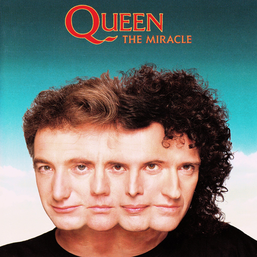
Queen
The Miracle (1989)

When Freddie Mercury called the rest of Queen into the room to announce his latest idea, the result was usually “Bohemian Rhapsody” or some other classic. This time, we got a bizarre cover take on the band as a four-headed rock ‘n’ roller. What’s odder is how each band member shares one eye with the next one. How this art was even chosen remains a mystery. But the attempt was almost certainly to present the band’s music as a shared effort and forgo the ego of the individual members. Just like the line in Jurassic Park: they were so preoccupied with whether or not they could, they didn’t stop to think if they should. Thankfully, Queen’s talent far outshined this weirdness of nightmares.
Primus
Frizzle Fry (1990)

Primus sucks and therefore so does their album art. If you’ve never heard this band, I’m certain you could pick up on their sound pretty quickly by looking at that cover. What’s a Frizzle? Why are we frying it? The band’s name lettering reminds me of some VHS-era movie titles—tall and strong. Conversely, the words “Frizzle Fry” look to be generated in a free font that, for some reason, shifts into a wave pattern. This is the kind of odd that leaves your brain sizzling, kind of like the Frizzle.
Queens Of The Stone Age
Era Vulgaris (2007)

QOTSA usually provides some sick album art. They get a little goofy with Era Vulgaris and give us these two lightbulbs that look like they walked off the snack video intro to a drive-in movie. This album art was supposed to be an homage to artist Frank Kozik, who ran the label that first signed the band and also made the image for The Offspring’s Americana, among other highly recognizable posters/album covers throughout his career.
Creed
Weathered (2001)

Nary has there been an album that was so revolutionary, so influential, as Creed’s Weathered (I see you singing “One Last Breath”). My guilty pleasure here is only overshadowed by shame: all of us at OddBeast love to hate on this album. The art is actually terrible. But with a “it’s so bad it’s good” vibe. Is that guy chiseling their faces into the tree? Who knows.
Jun Fukamachi
On The Move (1978)

Even in the ’70s, the Japanese really understood what Americans wanted, as illustrated in this oddity. We want more freedom, more hot dogs, more baseball, Coke … hell, give me more shrimp!
Art of the Album is a regular feature looking at the craft of album-cover design. If you’d like to write for the series, or learn more about our Clio Music program, please get in touch.


 Events
