


 Events
Classic, Innovative Album Covers From Design-Savvy Record Labels
With Beck, Tempest Storm, Herb Alpert, The Breeders, The White Stripes and more
Most contributors to this series select individual album covers. I’ve taken a slightly different approach.
I come from a generation when a record label, like a fashion house or an art gallery, served as a curator of taste. Spotting a familiar logo or visual system could draw me from across a record store or stop me in my tracks while flipping through an LP bin. I might not have heard of the band, but I trusted the label. Many of these labels proudly featured their logos on the front cover rather than tucking them away on the back. This placement suggested that the album I was holding was part of a larger story. Today, such bold branding is rare.
This was a musical era that came before streaming—when you couldn’t preview a track with a tap. It was often up to the cover to make the case and inspire someone to buy the album.
So instead of 10 covers, I’m sharing 10 labels (and in one case, a band). This body of work—musically and visually—has shaped not just my record collection but also my creative outlook.
ÉL Records

ÉL was an indie label that burned bright and brief from 1984 to 1990. It was immersive, whimsical and utterly distinctive. Their covers looked like stills from a theatrical daydream. Each sleeve told a fantastical story, filled with mystery and often featuring musicians dressed as knights, kings, explorers or eccentrics. In the pre-streaming world, these visuals offered an imaginative prologue to the listening experience. The covers and song titles filled your head with possibilities.
A&M Records

A&M has sold hundreds of millions of records since launching in 1962. I discovered them in the ’90s while flipping through the dollar bins at a local resale shop. I remember stumbling across a slew of interesting covers, all sporting the A&M logo, and bringing the lot of them home for five bucks. I didn’t just love the covers—I loved the music too. A&M’s style, particularly in the late ’60s and early ’70s, offered a window into a lush, optimistic modernism fueled by bossa nova, jazz-pop and Southern California sunshine.
Marina Records

Marina is a small German label with a big sense of style. Founded in 1993 and still going (albeit less prolifically), Marina has one of the most consistent aesthetics I’ve seen. Their mid-century Euro-modern sensibility, led by co-founder and designer Stefan Kassel, is elegant, clean and subtly playful. The covers are a masterclass in visual charm. They always look just right—and they’re always topped with the Marina logo.
Ghostly International

Ghostly was founded by Sam Valenti IV out of his University of Michigan dorm room in 1999. It was one of the first labels to fully embrace being a lifestyle brand, not just a distributor of sound. Ghostly has blurred the lines between music, product and platform. It has released shoes, radios, apps and even sculptural audio formats like the Matthew Dear “Black City” Totem. The Ghostly brand is minimalist but not cold, modern but never sterile.
Third Man Records: Blue & Green Series

Third Man Records launched its ongoing Blue Series in 2011. A diverse range of artists traveling through Nashville are invited to record a couple of songs with Jack White as producer. The cover photo and artwork are created immediately afterward. Although the music from single to single is diverse, the Blue Series covers create a sense of consistency. The fronts feature only a photo—no text or logo—while other details appear on the back. The Green Series, focused on spoken word releases, follows a similar approach with green as the unifying color. The use of color coding isn’t just an aesthetic, it’s functional, smart and memorable. (I was lucky enough to design some of these covers, including Beck and Tempest Storm.)
Impulse! Records

While Blue Note deservedly gets most of the jazz-label design love, I also have a deep appreciation for Impulse! Records. Their use of orange, templated spines and clear branding made their products easy to spot and instantly recognizable. The design was restrained yet powerful, formal yet funky.
Numero Group

My friend Rob Sevier helped launch Numero in 2003. Since then, they’ve set the standard for carefully curated reissues. Each release is more than a record—it’s an archival event. The packaging, liner notes, and photography are steeped in reverence and style. Like Impulse!, they understand the power of an eye-catching, cohesive spine. Line a shelf with Numero titles and you’ll see a visual rhythm that’s consistent, smart and deeply satisfying.
Le Grand Magistery

This one is personal. Le Grand Magistery is the label I founded in 1996. From the beginning, I wanted the label itself to feel like a trusted curator of international pop. If someone loved one record, I wanted them to pick up the next because it was adorned with the same logo. I designed most of the covers myself, often on shoestring budgets. I took the majority of the photos, did the layouts and handled the production. The goal was to evoke a kind of pop romanticism where artwork and sound were always in sync. It was as much about vibe as it was genre.
4AD

No list of label design would be complete without 4AD. Through the work of Vaughan Oliver and v23, they established a visual language that felt closer to gallery installations than commercial packaging. Atmospheric, ethereal and often abstract, their sleeves didn’t explain—they invoked. You didn’t need to understand them; you just had to feel something. Many have tried to copy their aesthetic, but few have come close.
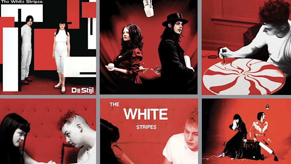
The White Stripes

I’m cheating a bit here, because the White Stripes are a band. But they understood branding more clearly than most labels (and brands!) ever have. Their red, white and black palette was absolute. They never wavered. Every photo, album and merch piece followed the same code. Their visual language was about color, silhouette, mystique and discipline. Even as the concepts evolved, the identity stayed intact. They built an entire universe from three colors. And it never got old, just deeper. (I designed two of the covers—the ones with Jack painting the peppermint swirl, and Jack and Meg holding hands.)
Honorable Mentions
If you’re a record label enthusiast like me, here are a few others that are worth digging into for their unique and consistent looks and sounds: Blue Note, Command Records, Factory, Precious Recordings of London, Sacred Bones, Sarah Records, Teenbeat and Trattoria.
The 2026 Clio Music Awards are open! Enter your most creative work HERE by Oct. 3.
Art of the Album is a regular feature looking at the craft of album-cover design. If you’d like to write for the series, or learn more about our Clio Music program, please get in touch.

Matthew Jacobson is a creative and strategic leader whose work bridges music and marketing. Learn more at matthew-jacobson.com.