5 Album Covers With Great Stories Hiding in Plain Sight
Prince, Talking Heads, Charli XCX and more
Nothing shapes culture like music, and album covers are the visual and physical manifestation of that unmatched cultural force. A cover is like music you can see, touch and hold.
I tried to focus on examples that are well known, but with great stories hiding in plain sight. Often, iconic work becomes so ubiquitous that we stop noticing the nuances—or even forget their importance. Here are five covers that should mostly feel familiar (except for one), each with lessons to share and stories worth telling.
Radiohead
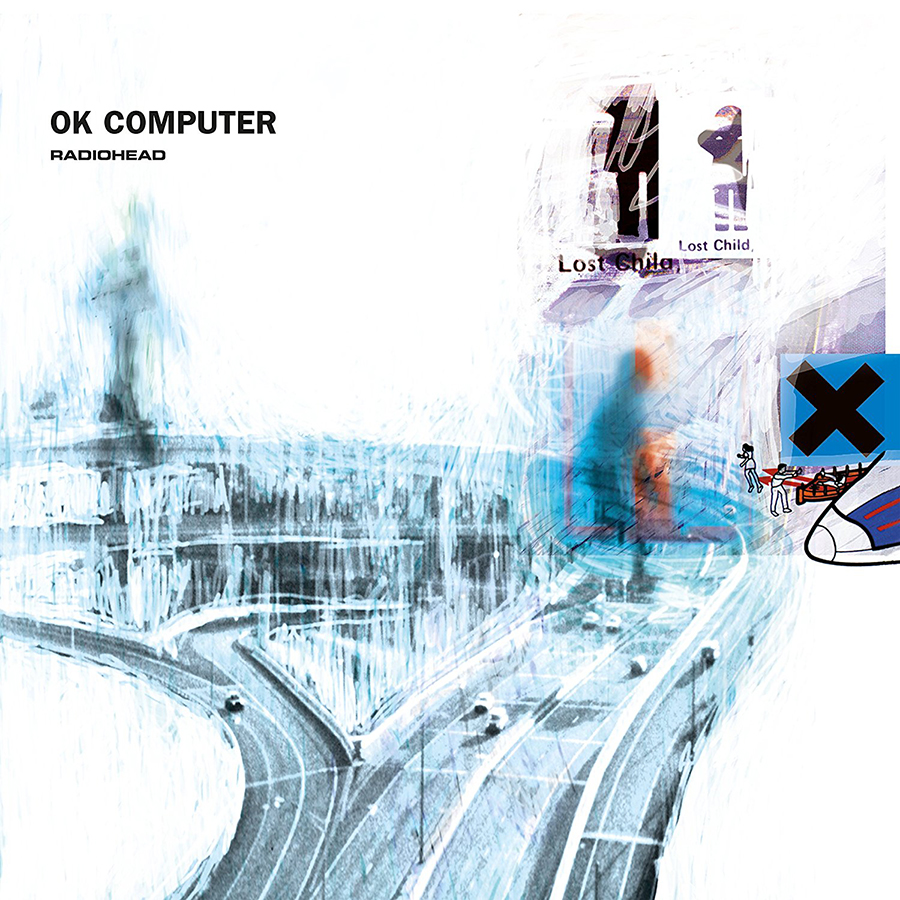
OK Computer (1997)

I could have chosen any Radiohead sleeve by Stanley Donwood, since he has helped fashion every one of the band’s covers since The Bends. But OK Computer hits close to home. Released in 1997, at the dawn of the internet, it captured the spirit of a digital renaissance in music, film and design. It was a time of radical creativity—full of promise, experimentation and new aesthetics. What strikes me most, though, is the collaboration itself. For nearly three decades, Donwood has been more than just a designer. He’s become the unofficial sixth member of the band. His work doesn’t just package the music. It shapes the experience, helping steer where the band is headed. There really is no Radiohead without Stanley.
Pedro Santos
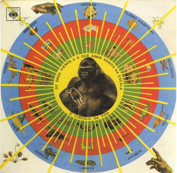
Krishnanda (1968)

This is a forgotten but incredibly powerful and deeply personal record by Pedro Santos, a self-taught Brazilian percussionist who lived a deliberately peculiar life. On Krishnanda, he composed and arranged the music and played every instrument (even inventing some new ones). He also created this striking and enigmatic cover: an infographic of sorts that expresses his personal philosophy of life. A mysterious composition about the cycle and scale of existence, it seems to follow a logic that only made sense to him. The image offers a direct, unfiltered connection to Pedro’s psyche and delirious world. Its dynamic power seems to come from a raw honesty. Every design choice is both perfect and irrational. Sometimes, feeling the impact of something matters far more than being able to completely comprehend its meaning.
Prince
Dirty Mind (1980)

Can’t think of a more authentic, culture-bending artist—and this cover captures it all. On a mission to blow off all hinges with raw genius and more balls than any punk rocker, here is a 19-year-old kid from Minnesota, staring you in the eye with absolute confidence that there would be no one else like him. The cover shows a subversive, stripped-down, black-and-white version of glam and makes it clear—well before you drop the needle—that this music is explicit and here to push things. The best part was that his talent was right there, in lockstep, transforming his transgressions into infectious beats and blowing minds in the process. Cover by Allen Beaulieu.
Talking Heads
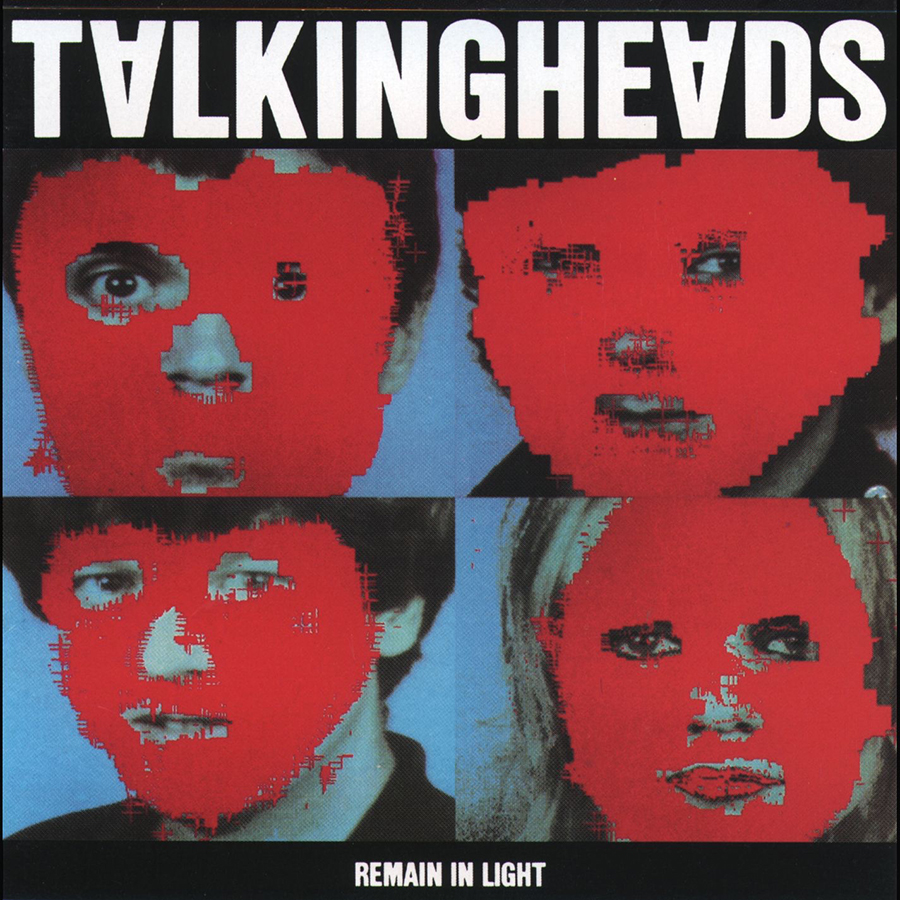
Remain In Light (1980)

This was designed by one of my heroes, Tibor Kalman. He was one of the most influential graphic designers ever, founder of the legendary NYC studio M&Co and co-editor of Colors magazine. Tibor was a subversive genius who always worked wonders with incredible simplicity and elegance. The subtle inverted “A” and the obliteration of the faces—done with new digital technology of the time—are details easily missed. A post-punk album created with the highest tech available perfectly matches the “art band” style of the Talking Heads. That quiet use of a new medium in such a strange way feels timeless.
Charli XCX
Brat

This one is a masterclass in how something so simple can completely dominate culture. I’ve barely listened to Charli XCX’s music, but like everyone, I absolutely know this cover. It’s not every day that an album becomes the color of the summer—or an emoji on Microsoft Teams. The story behind this cover is actually more interesting than you would expect. Charli and the designer describe taking five months to commit to the right font and the exact shade of green. It was specifically chosen by Charli as an off-trend shade meant to cue that something was wrong. It almost feels like they’re trolling us with a fictitious tale of complexity. But in the end, it doesn’t matter. It looks like they had fun with it. And the cover even shifted, changing color and messaging during the launch phase. It’s proof that even the simplest idea, handled with the right conviction, can take over culture and get stuck in everyone’s head. Cover by Special Offer Inc.
Art of the Album is a regular feature looking at the craft of album-cover design. If you’d like to write for the series, or learn more about our Clio Music program, please get in touch.


 Events