How Music Culture and Thinking Outside the Box Inspired These Chicago Sky Game-Day Posters
Each and every one is a singular work of art
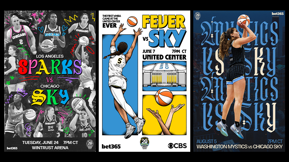
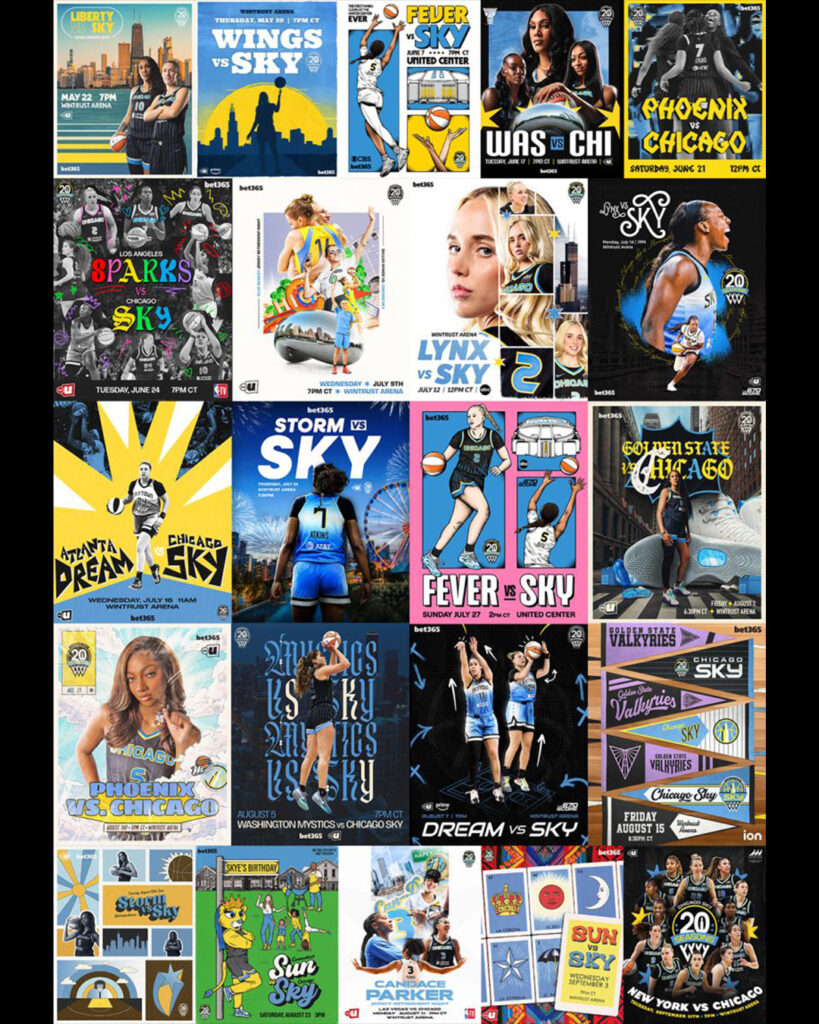
Fans who attended Chicago Sky home games this season received artful giveaways—one-of-a-kind posters designed to highlight each matchup.
Now, giving away posters at sports events is common, but these aren’t your typical sports posters. Incorporating illustrations, varied fonts and retro flair, these gems look more like cool gig posters. You know, the ones you see plastered around the city and at venues when your favorite band hits town for a show.
Each and every one is a singular work of art. And if you were lucky enough to get your hands on some, hold onto them. They are likely to become collectibles.
The idea came from Mikaela Kennaway, the Chicago Sky’s senior manager of brand creative and design. Prior to joining the team, she worked in the music industry for a decade as an art director, designer and illustrator. That’s where the inspiration for the Sky’s home-game matchup posters was born.
“Unique posters for each stop of a tour are a huge market right now in the music industry and creating those posters was one of my main roles within music,” Kennaway tells Muse. “I wanted to do something that made the Sky’s social presence and graphics stand out to other teams in the WNBA and thought why not try the tour poster approach for each of our home games.”
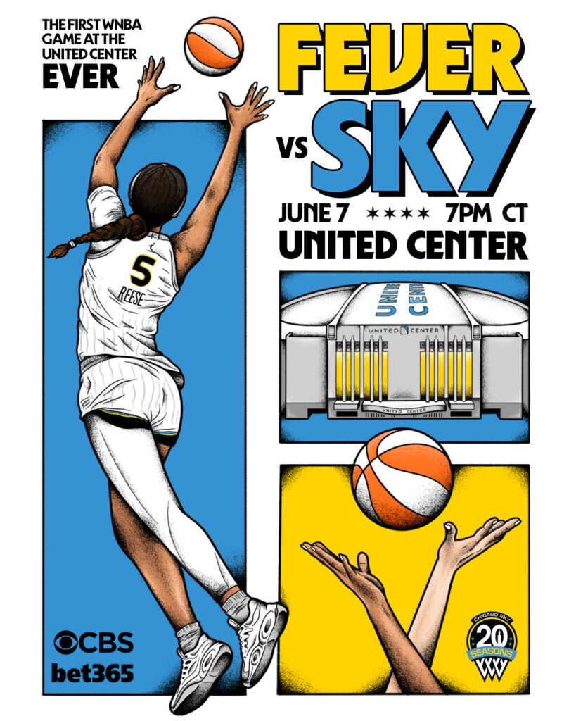
When Kennaway proposed the approach to Chicago Sky chief marketing officer Tania Haladner, she was all in.
“We are always looking to differentiate the brand through unique designs and activations, and we’re thrilled Mikaela and her design team can help us create art that Sky fans love,” Haladner says.
Here, Kennaway discusses the eye-catching work and talks about the value of bending the rules when it comes to your team’s design aesthetic:
Each of the designs spoke to me. It’s impossible to choose a favorite. What kind of team did you have to create this art, and what kind of prompts or guidance did you give your designers?
Mikaela Kennaway: In terms of look and feel, I wanted it to be a free creative space for the designers to play with. So there were no strict parameters for the creative direction at all. With sports, we generally have to stick to a very specific aesthetic throughout the season, using strict branding guidelines of chosen fonts, colors and logos. A lot of our graphics are templated out in advance. So, giving our designers a place to experiment with new styles, get super creative and have some fun was super important to me.
They were all created in-house by our design team, which consists of myself, two mid-level designers and an intern. Outside of prioritizing the team’s colors—blue, yellow, black and white—our logo and making sure the matchup information was clear, the designers each had creative control. We would try and make sure a wide variety of players were featured across the range of posters. Sometimes we would play on the theme games, or play off the team matchups.
They would send their concept idea to me and our CMO for approval, then it was all systems go.
Did you personally design any of them?
I designed 10 of the 22 matchup posters for the season.
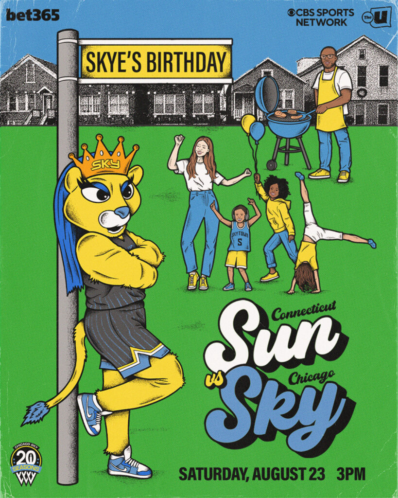
Can you explain the thinking behind the poster promoting the Chicago Sun-Chicago Sky matchup as well as team mascot Skye’s birthday?
Skye’s birthday poster concept came directly from Skye herself. She wanted her birthday game to feel like a good old fashioned Chicago block party. For that game we had tumblers, dancers, games and food outside the arena. So, I tried to emulate that in a fun way, while keeping the “fans” on the graphic diverse, to represent how diverse our fanbase is. I love a chance to showcase my illustration skills, and this seemed like the perfect opportunity to do so.
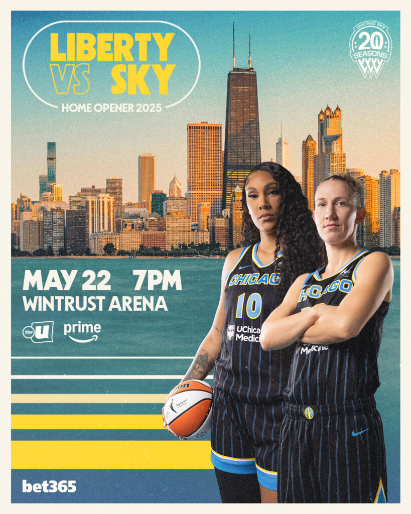
And the one promoting the New York Liberty vs. Sky game?
The Liberty vs. Sky game was our home opener and right at the start of summer. There is something truly magical about Chicago in the summertime. So I wanted to try and give the poster a summery, vintage feel and showcase the city a little as well as the players. It was Courtney Vandersloot’s first game back with the team and Kamilla Cardoso’s second season with us. Featuring those two players made a lot of sense for the way that they play together as well. Stylistically, I drew inspiration from Olympics posters and advertisements from the ’70s and ’80s.
You have a CMO who embraced this creative idea. Can you talk about Tania’s reaction when you pitched it to her?
Tania told me she wanted to really elevate our graphics in new ways that hadn’t been done before. I don’t come from a traditional sports background. So bringing in new ideas that other teams had maybe not explored before was a big part of my approach to the role. Pitching this idea was something that meant a lot to me personally. So it meant everything to have Tania on board with bringing it to life.
As you mentioned earlier, teams have certain aesthetics and design rules they follow. But you bent the rules here to do something fun and different. Why it is a good idea to do things differently sometimes when it comes to design?
Doing things outside the box can become part of your team’s aesthetic. We have so many eyes on us all the time through the good and the bad, and sometimes sports design can start to look the same. You can set yourself apart with your team’s aesthetic, whether by using unusual fonts that aren’t typically seen in sports—the Cleveland Cavaliers are a good example of this. Or use memes and being super sassy—the Phoenix Mercury are legendary in this approach. You have to find ways for your team to stand out, outside of the performance on the court. As a design team, our main job is to make the girls on our team look good and feel good as much as possible. We exist to celebrate them. And I think taking a risk and being creative in how we do that really paid off and can eventually be something we are known for as a team.


 Events