11 Album Covers That Rekindle Record Store Magic
Massive Attack, Bowie, Los Lobos, Miles Davis and more
In the late ’80s and early ’90s, record stores were like an oasis for the imagination. Even when I had no money to buy anything, a trip to the local shop always provided temptation through album cover art. Once I was able to visit the larger stores in NYC, like Tower Records on West 66th or East 4th, the floodgates opened. The album art always provided an entry point, and sometimes a complement to the music. Here are a few that have stuck with me through the years.
Massive Attack
Protection (1994)
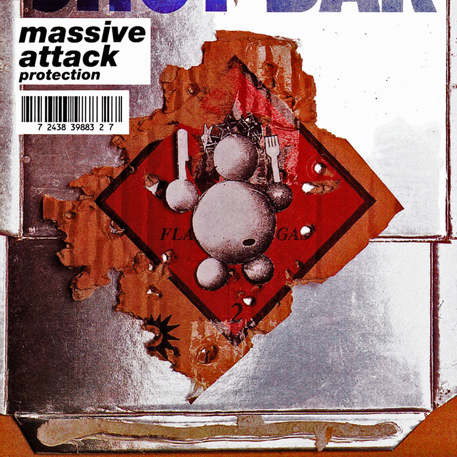
Protection sucked me in and made me a lifelong fan of Massive Attack. The beats and downtempo melodies forged a genre unto themselves. Imitated but seldom duplicated. The cover builds on the simpler, flammable-materials sleeve of their debut album, Blue Lines. It is layered thick with 3D graffiti-inspired artwork; the italicized font and barcode are the cherry on top. The imagery echoes the feel of the music—handmade, cut up and delivered with a gorgeous feel. Artwork + Design: 3D and Michael Nash Associates.
David Bowie
Lodger (1979)
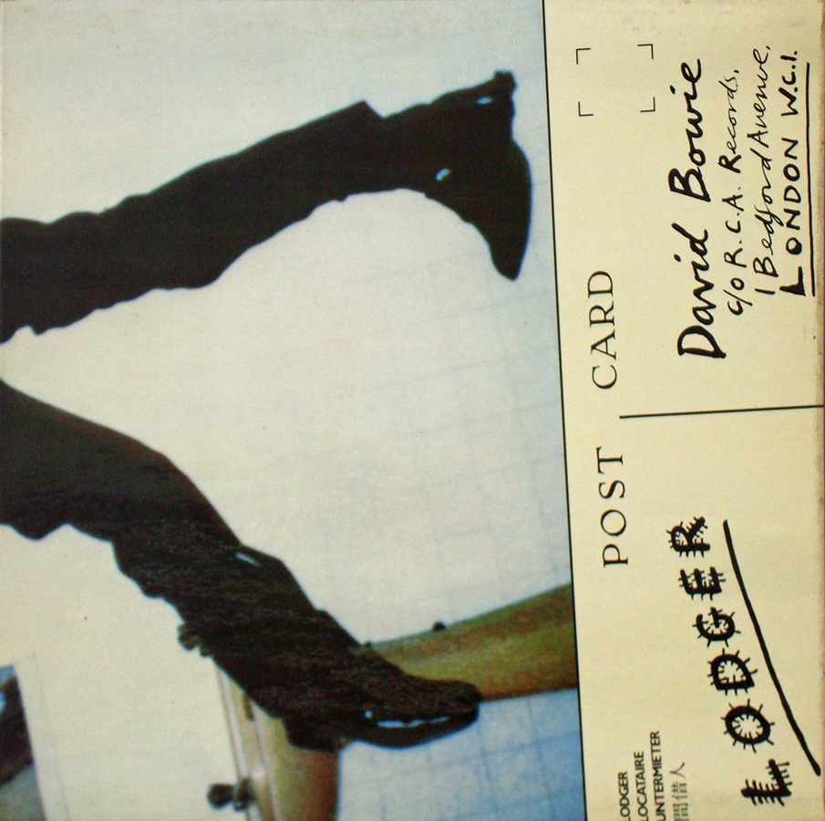
David Bowie’s oeuvre yields many great covers, but this one always felt so intensely strange. What was happening here? He’s fallen, he’s got a razor, a busted nose, bandages, contorted body. Is he actually on the ground or standing up? Postcard details with “Lodger” in handwritten, hairy letters. There’s a queasy story here. But who can say what that is? That is the fun of it: the mystery. Photography: Brian Duffy, Design: Derek Boshier.
The Double
Dawn of the Double (2016)
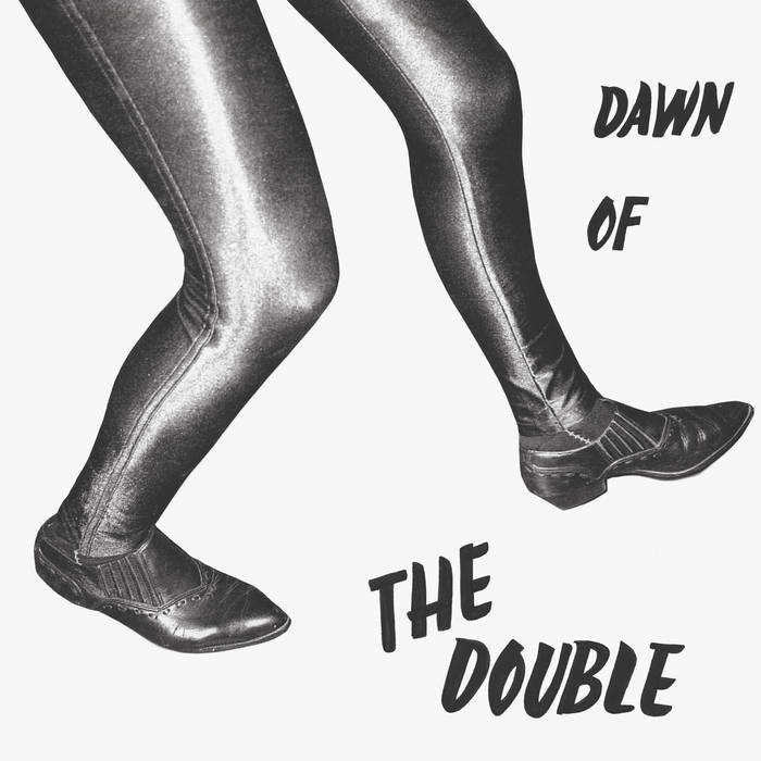
Emmett Kelly on guitar and Jim White on drums. Recorded live and described as an attempt to perform a “dance piece.” One chord, pure rhythm. Repeated for 40 minutes. Trance-inducing stuff. The cover is super simple but funny and evocative. The font, the monochromatic tones, the shoes, the tights! Vaguely sinister, sorta amusing, garage-y goodness. Cover: Michelle Ross, Photography: Maximilla Luckacs.
Everything But The Girl
Amplified Heart (1994)
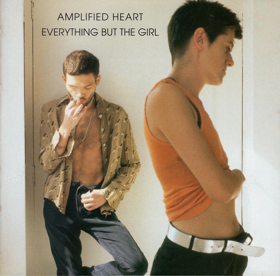
Their usual lovely arrangements and melodies hold a melancholy that is echoed in the artwork. A very posed study of Tracey Thorn and Ben Watt, edging somewhat closer to fashion photography but feeling very intimate. The record came about after a period of illness in the band, so this was in many ways a return from the brink for them—another case of artwork matching the music on the record. Design: The Senate, EBTG, Cover Photo: Richard Haughton. Interior Photo: Corinne Day.
Faith No More
Angel Dust (1992)
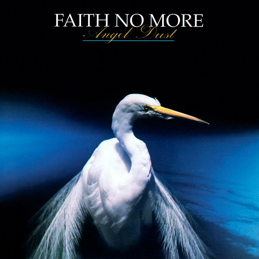
Just a beautiful cover image. I’d heard about the record being “difficult” after the big success of The Real Thing. In a way, the cover was scary because I knew it hinted at darker things, and the back photo was even more overt. I didn’t get into this album until years after it came out. I always had time to stare at this one when I was at The Wiz or Sam Goody. Photo: Werner Krutein.
Harry Nilsson
Nilsson Schmilsson (1971)
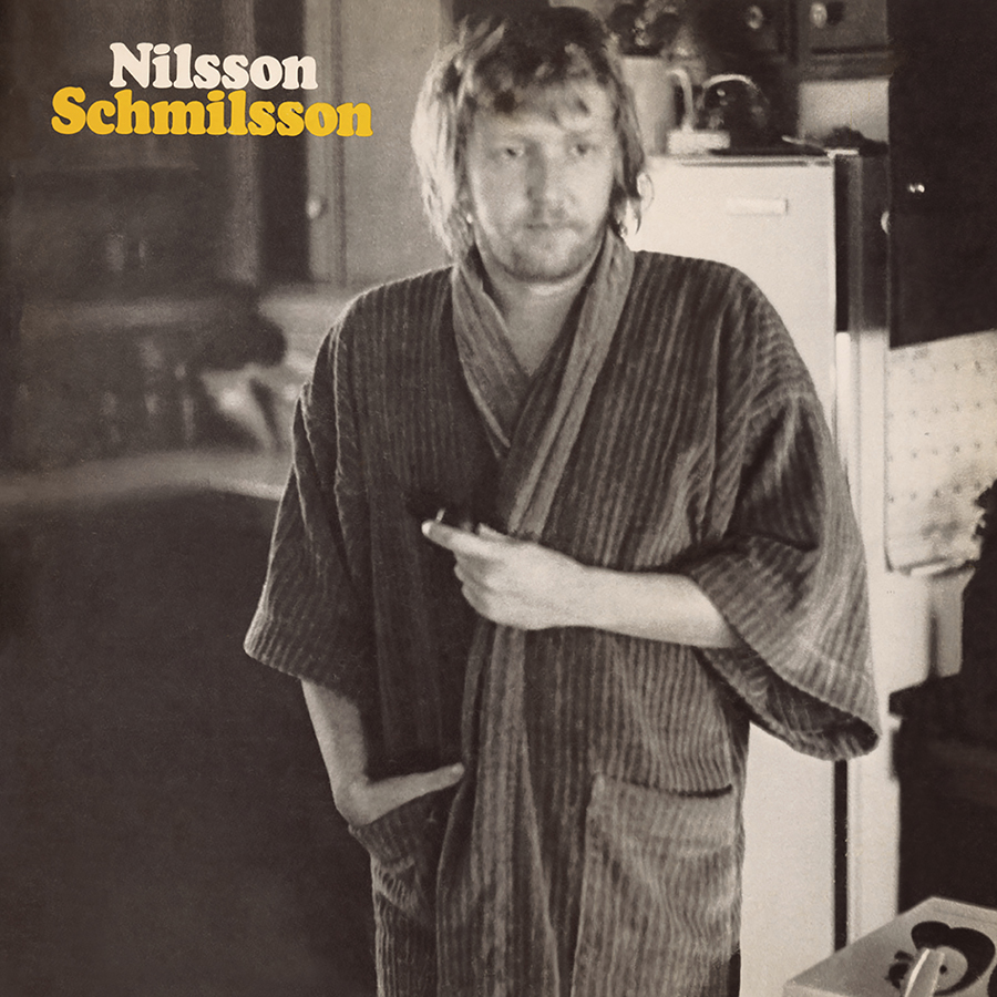
A foggy-headed, hungover mood conveyed by a simple, slightly out-of-focus image. This pretty much sums up Nilsson’s life at the time in a nutshell. The songs are great, the record blew up and he dove headfirst into rock star excesses. Nothing after reached these heights (save for a good LP with John Lennon and, of course, the live-action Popeye soundtrack). Graphics: Acy Lehman, Photography: Dean Torrance.
Los Lobos
La Pistola v el Corazón (1988)
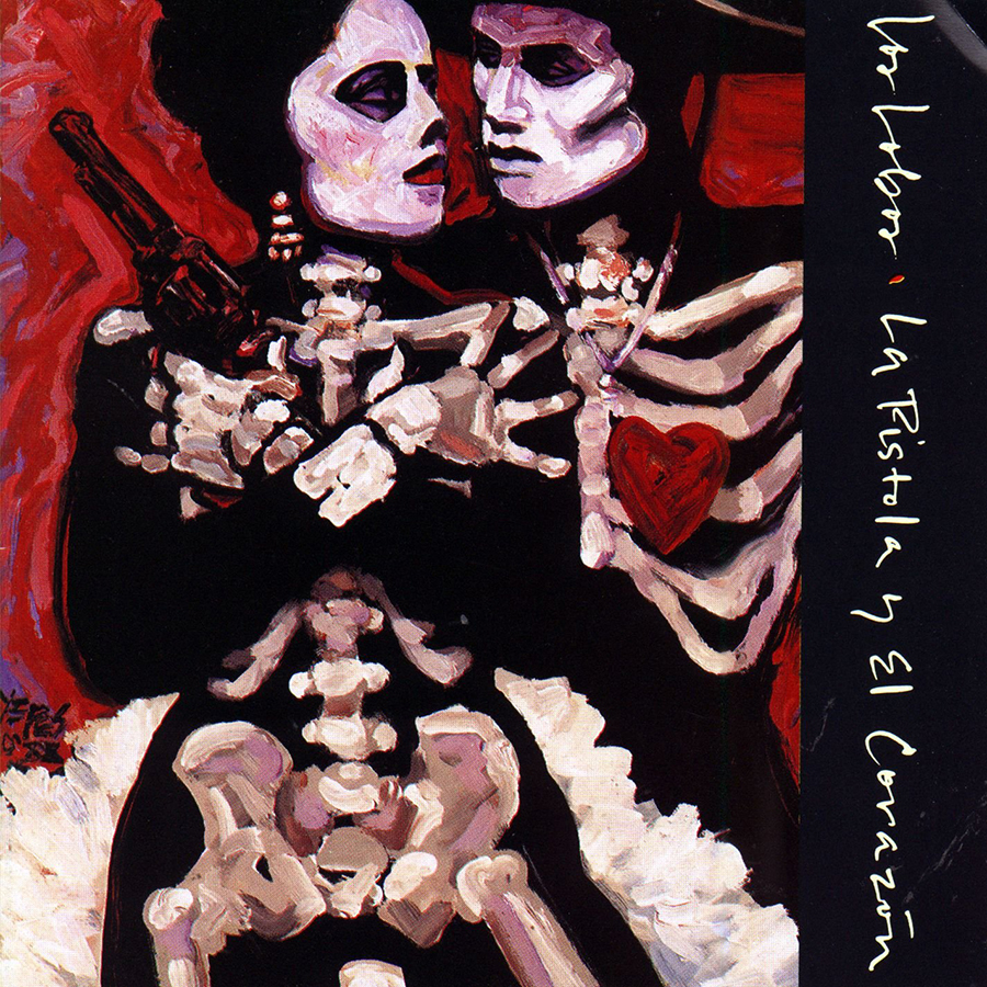
The heavy brushstrokes and thick paint lend an emotional weight. Romantic but not sentimental. Powerful and proud. A great image to complement the ranchera and mariachi style. Painting: George Yepes.
Miles Davis
Live – Evil (1971)
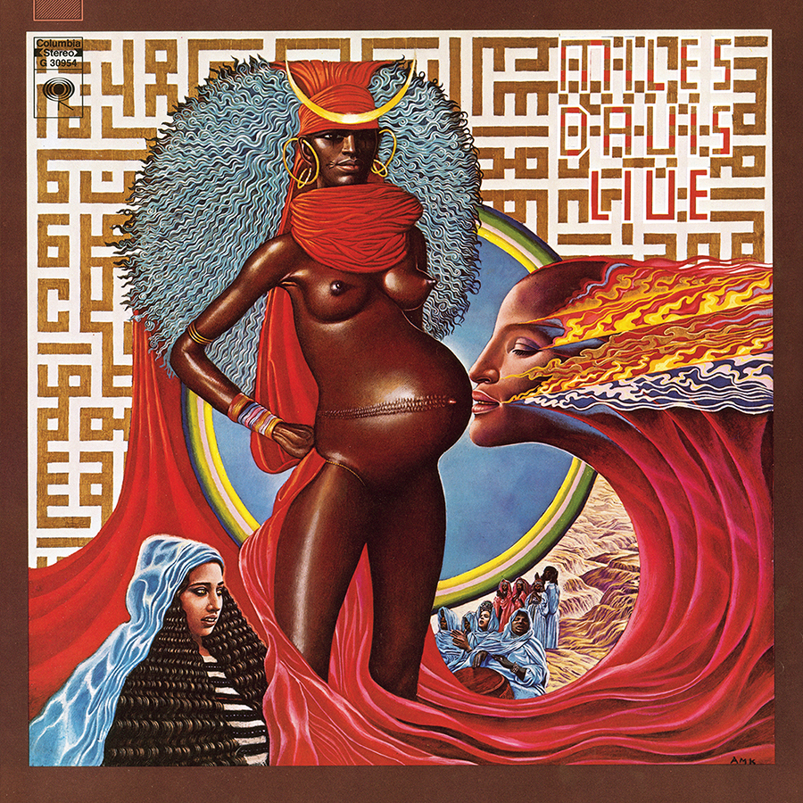
Beautiful music about freedom told through melody and rhythm. The cover features pyramids, flames, waterfalls and a pregnant woman in the foreground (Live). The back cover shows a monstrous creature, its face inspired by J. Edgar Hoover (Evil). Stunning. Artwork: Mati Klarwein.
Mogwai
Hardcore Will Never Die, But You Will (2011)
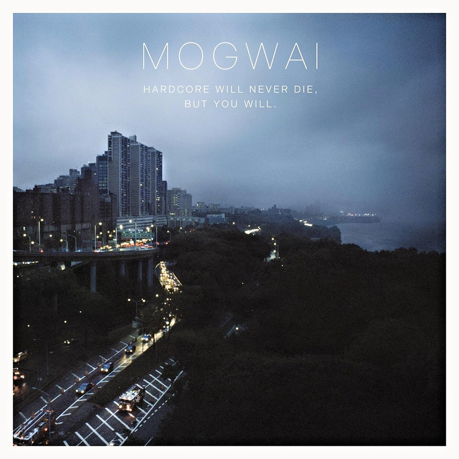
I love this image of Manhattan’s Henry Hudson Parkway, looking south from the GW Bridge. Living in New York City, it’s a view I’ve seen countless times in all seasons. But it never looked this beautiful. Antony is a super talent, and this cover image is my favorite out of all the Mogwai albums. While it evokes home, it also echoes a heavy mood that complements the wonderful sounds on the LP. Photography: Antony Crook.
Underworld
Beaucoup Fish (1999)
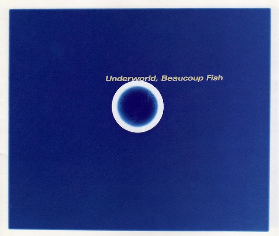
Working with multidisciplinary design studio Tomato, this cover is a super clean field of blue with a simple geometric shape within, depending on the album format. I loved the album from the get-go. Likewise, the artwork felt like a stylized shot of color and energy. Artwork + Design: Tomato.
UNKLE
The Time Has Come (1994)
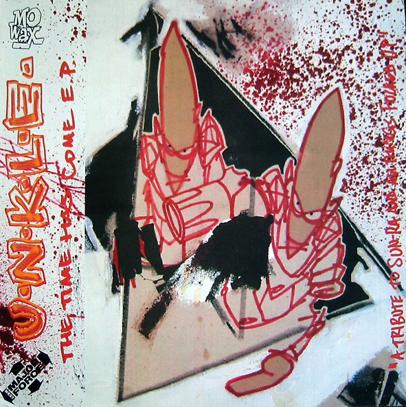
Every sleeve done at Mo’Wax from ‘92 until the release of UNKLE’s Psyence Fiction in ‘98 was a thrill to behold. Cut ‘n paste graphics, Swifty label logos, subtle designs from Ben Drury and Will Bankhead—all of this scratched an itch for me. The hip-hop-inspired graphics, complementing the diverse music they were releasing, were very inspiring. The first appearance of Furtura 2000’s Pointman logo for UNKLE appeared on this E.P. and has been included in every album of theirs since in some or other form. Iconic is an overused phrase, but not here. Design: Swifty, Artwork: Futura 2000.
The 2026 Clio Music Awards are open! Enter your most creative work HERE by Oct. 3.
Art of the Album is a regular feature looking at the craft of album-cover design. If you’d like to write for the series, or learn more about our Clio Music program, please get in touch.


 Events